Mia Erie Animated Logo
Photographer Mia Erie asked for a new visual identity that needed to match her new photography theme and style. She is a maternity photographer, inspired by nature and it’s many colors, shapes, and its beauty.
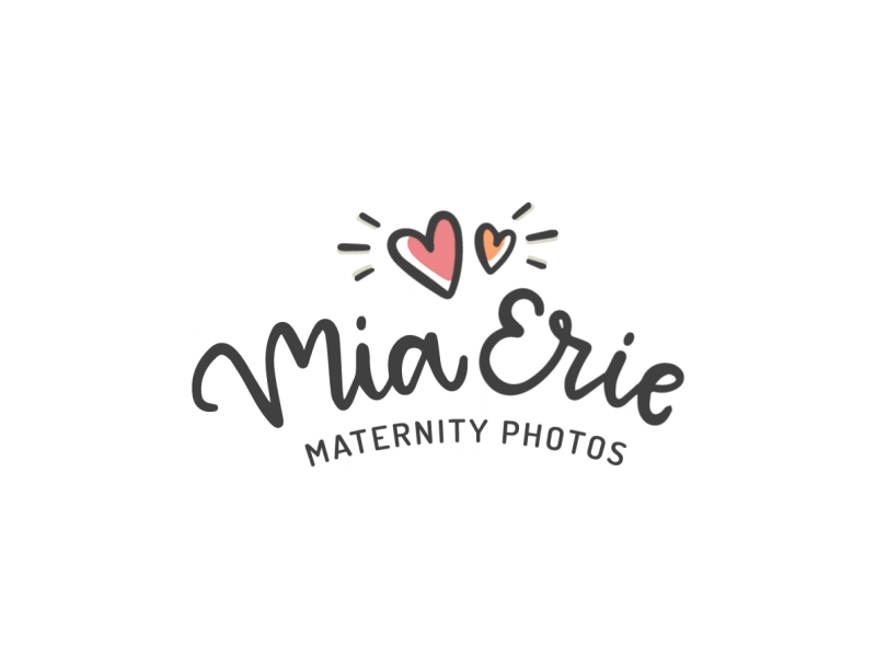
The symbol depicts the love between mother and child by using different heart sizes (the big one being the mother, the small one meaning the baby).
The lettering was made in a cute and romantic style to relate to the photography tone that Mia Erie produces. The handmade lettering in this arch curvy style makes it more dynamic and humanizes the brand.
The font is round and squared at the same time, bringing an organized mood that isn’t too serious.
Colors were picked using her own maternity photos as a palette.
Then I created some handmade icons that we will use in her future website.
See more of this work: http://bit.ly/miaerie-logo
