Logo design challenge #18 - LaserCut

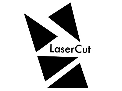
Logo design for LaserCut, a company dedicated to 3D printing and cutting. Their cuts are done with water and abrasives propelled at three times the speed of sound to make accurate and precise cuts in virtually any material.
Key elements to LaserCut are details, precision, accuracy and sharpness. I used Futura Medium, a highly geometric font, to convey sharpness.
The repeated element in my logo proposal is a triangle, a shape that is also associated with sharpness due to its angles.
The play between negative and positive space is another visual representation for the sharpness and details that LaserCut proudly has.