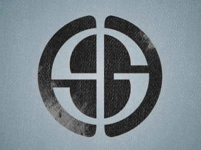
Steve Granshaw Logo
My very own logo that is both an ode to design and representative of my theory-based approach to the subject. The SG monogram is structured according the golden ratio and is combined with a serif capital 'i' to resemble the phi symbol. The resulting SG/phi shape is then cut into a circle, which creates the two hemispheres of the brain, with the help of the serifs of the 'i'. I've attached a diagram that highlights the golden ratio within the design. The texture is a purely aesthetic touch and I owe credit to Chris Spooner for his excellent tutorials on application of texture. Any comments welcome, but be nice - this one's quite personal to me!
More by Steve G View profile
Like

