Daily UI Challenge #009
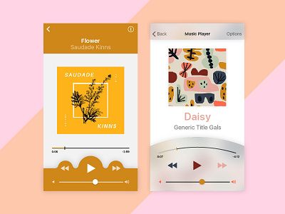
2 tries at a music player UI design, I prefer the one on the right due to the curved time tracking bar, it seems a bit more playful too. I designed it with the idea in mind that the app could colour pick from the album cover art and apply those colours to the buttons and dials in the app while still maintaining decent contrast for visibility.
Light themes, using iOS skeletal structure and some original twists in colour and UI accents. For many of my designs I reference to the iPhone iOS GUI templates. Daily UI Challenge #009.
#dailyui