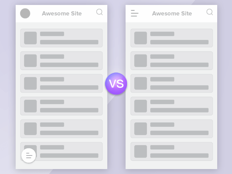
Thumb-friendly menu vs Hamburger menu
Which one would you go for?
Context of use: Main navigation for enterprise web application. Total menu items consist of 10 or more items.
Hamburger menu The common display of main menu. Easily recognizable. Less cognitive load. Navigation: clicking on hamburger icon to bring up main menu items
Thumb-friendly menu To create thumb-friendly menu, easy access within the "thumb zone". Navigation: clicking on floating icon to bring up main menu items
Thumb zone "It’s important to place top-level and frequently-used actions at the bottom of the screen, because they are comfortably reached with one-thumb interactions."
Bottom menu is within thumb reachability and require less physical manoeuvring/ re-grip of the mobile device. Therefore, allowing faster task time.
Research by Steven Hoober on Thumb zone: 49% of users held on their mobile device one-handed. Within the group of one-handed use: • with the right thumb on the screen—67% • left thumb on the screen—33%
Green space covers the thumb-friendly zone, which could be utilised for frequently used elements.
Related article: How Do Users Really Hold Mobile Devices?