Spotify Sign Up

Here's a Sign-Up page for Spotify I worked on recently. Spotify is an app I absolutely love, and use pretty much everyday, and while doing some browsing around their website a few days back, I noticed their sign-up page. While the in-app experience for Spotify is generally fantastic, the web experience felt a bit more bland, so I thought I'd attempt to mock up something a bit more adventurous.
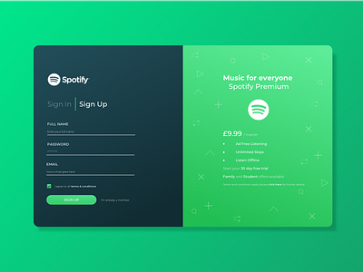
The concept here is focused around a split panel, which features both the sign in and sign up sections of the form on one side, easily switched between using a toggle at the top of the form, and some product details on the right hand side.
For branding in this case, I did of course have to stick closely with Spotify's colour palette and use of iconography, but wanted to experiment and see what I could do with it here. I really wanted the bold green to stand out here, so used it for the primary button on the page, as well as the entire right panel. While Spotify tend to use dark colours and their primary green logo, I made use of a white version here as I felt it tied in better with the overall theme and feel I was going for here. The right panel details product details on what a user can get for their 'Premium Membership'. I thought it important to highlight these benefits here, as Spotify do offer free membership, and wanted it to serve as a reminder of what more these users stood to get out of the product if they went premium.
To add to the bright and playful nature of the right panel, I utilised some of Spotify's and my own iconography which features in the background with a slight opacity, so as to not overpower the text.
The initial wireframes and some of my more behind-the-scenes thinking can be found on my Instagram
Be sure to follow me on Social Media:
Instagram | Behance | Medium
