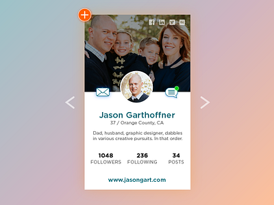
Daily UI 006 - Profile
I spent more time than I care to admit on this piece. I wanted to keep the layout itself fairly simple, and to keep it from being boring I tried making it colorful and applying little things like a drop shadow on certain elements to give it a glowing look rather than a lifted up feel.
More by Jason Garthoffner View profile
Like
