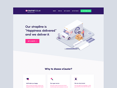
eCourier - Landing Page Header
Hi there,
This is a redesign for a courier company from UK called eCourier. I'm doing this for fun and practice and decided to have a different approach than usual.
I've tryed to use an illustration in the header, but I'm not sure about it. This is still in early WIP so there may be many changes along the way.
Your feedback on this is really appreciated!
Have a nice week!
More by razvan.design View profile
Like
