Layered Studio Brand
We’ve launched our studio identity with a clear visual language and a typographic wordmark.
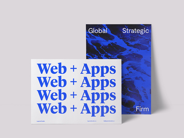
Since our core is to deliver outstanding digital products we wanted to distance ourselves from the sobriety of black. The selection of blue as our primary brand color was natural through the exploration of web elements and choosing a close shade of hyperlink blue.
Full Project here: http://goo.gl/Lk4Goy
