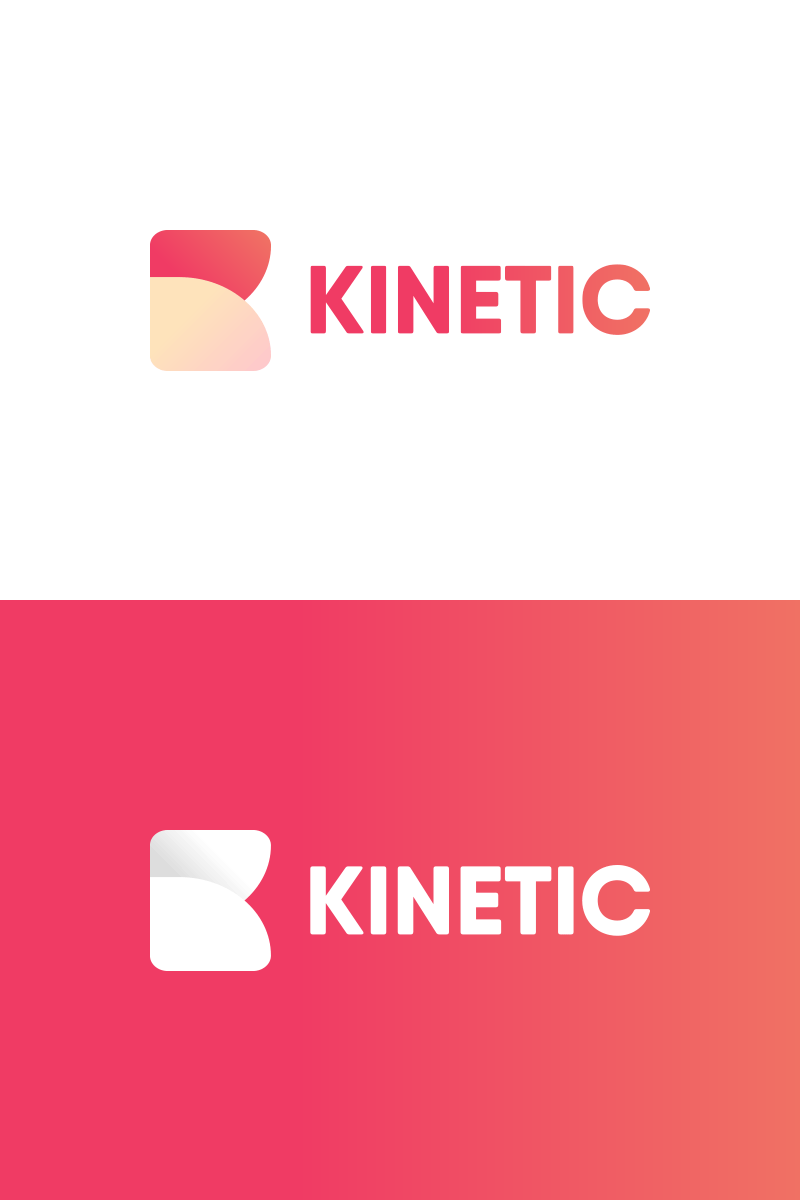
Kinetic - Unused Logo Concept
Another unused branding concept I was really fond of from last year. I elected to go with a rounded, minimalist combination of two curved shapes for the ‘K’ symbol to visually represent the movement inherent in the word ‘Kinetic’.
More by Matt Campbell View profile
Like
