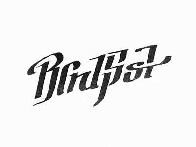
BlindSpot
I just took a shot of what I've done so far with pen on paper.
Logo for hard/alternative rock band.
The idea of connecting or blending the letters came from the name BlindSpot - I wanted to make reader feel like he has a blindspot in his eye, because you can't see all the letters at once. I like the seek and hide game in it.
I would like to hear your thoughts on it, thanks!