Agriculture Logo
Logo concept for a practicum studio project. I can't give too many details right now, but my team and I are designing the branding for an agricultural college's public exhibition. The theme of the show is "Working Together".
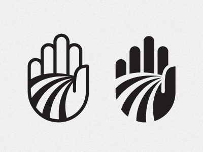
I ran with the idea of a farmer's hands being a critical part of their work, and then began to draw off of the lines in the palms and abstracted those into rows of crops in a field. Depending on if the logo is reversed out, the fingers read either as fingers or as grain silos in the distance.
Overall I'm really happy with the forms, but the main critique I've gotten is that it looks like a hand telling you to stop. Any ideas of how to keep the visual metaphor, but get rid of the "stop" message?