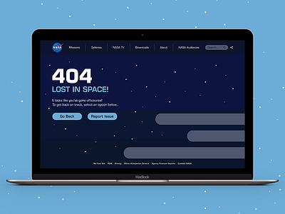
Daily UI 8: 404 Page
I chose to create an error page which was clear and provided key information to resolve a user's situation, as seen through the use of two navigational buttons.
The options within the navigation are kept fairly simple, with the ability to access further sections through pop-out menus appearing beneath the different elements.
I chose colour and type which I feel reinforced the idea of space travel and linked relatively closely to NASA's brand identity.
More by Richard Gray View profile
Like
