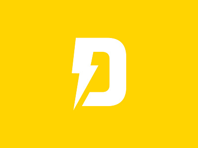
Direct Currents Logo Stacked
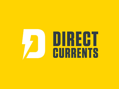
Here's a logo I created for a large Canadian industrial electrical company, Direct Currents
The goal was to create something that had strength but nodded to their company history and age of their business. The simple D logomark took inspiration from logo's of the 50's where simplicity was always key.
Combining a chunky D with a simple electricity bolt represented the nature of their work as well as the company strength and professionalism.
The chunky type further re-iterated these points