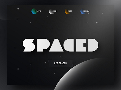
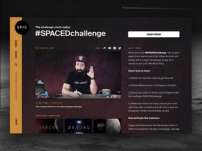
SPACED Logo and Homepage Concept #SPACEDchallenge
Homepage design Concept.
Logo Concept =================================
Hello Designers,
Here is my logo design idea for @epicurrence and @Dann Petty's Amazing #SPACEDchallenge.
The concept based on following thoughts:
1. I took the word spaced literally. My initial thought was to make it "spaced" not "space". As you can the whole logo consists a whole lot of "space" which is vast 3-dimensional region that begins where the earth's atmosphere ends (Copy&Pasted)
2. I tried to incorporate a tiny but fast enough spaceship (CED) to bring back Mr. Starman who is stuck somewhere between Mars and Jupiter, safely.
3. Almost every thing in space is roundly. So I tried keep it that way.
I hope you liked my approach,
Update: Logo is slightly updated.
================================
Thanks

