SPACED | Logo
Logo design submission for #SPACEDchallenge @Dann Petty
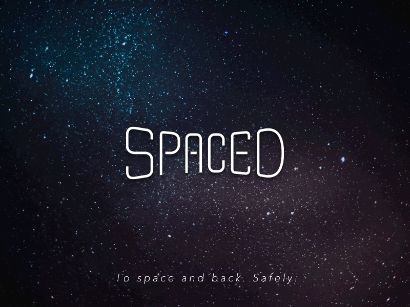
The concept for the logo comes from the unoccupied area between two planets and how to convey this "space" as a bridge between our place of origin and our destination.
The logo is clean, simple and safe. SPACED is not a thrill ride, it is not going to overwhelm you. The panoramic shape signifies an enigmatic sensation that our customers are going to experience. Color of the background is subdued to entice the customers on the wonders of space and it's mystery, while also making them feel safe amidst the risks involved.
This was a real fun challenge! I enjoy designing this logo. Cheers!

