Daily UI 16- Popup

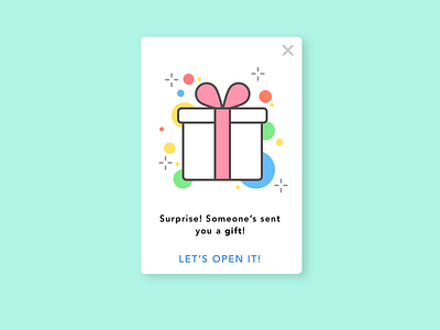
Just something cute for today's challenge. I had to rethink the verbiage for the link-- something too clever could obfuscate the meaning of what I wanted the user to do. The 'X' subtly allows the user to exit out of the transaction if they wanted to, while the placement and color of the CTA pushes the user to accept and continue. That's my thinking, anyway. CCW!