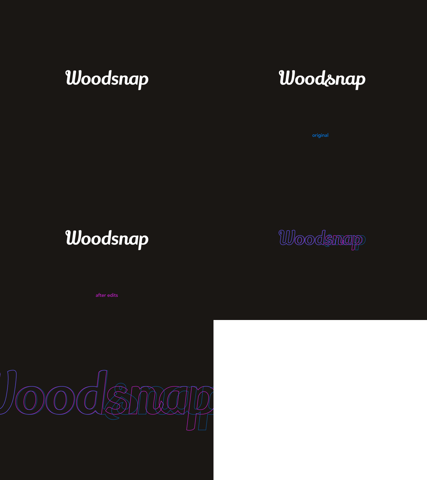
Woodsnap logo construction
Here's the logo with a glance at its construction. I made some little edits to the original font in order to make it simpler, sharper... "make it pop" a bit more.
I don't really have an idea how could I describe it better...
Keeping the streak going for the 4th day in a row. Wow, just — 👏 — thank you.
More by Albert Zikmund View profile
Like


