active design conference logotype
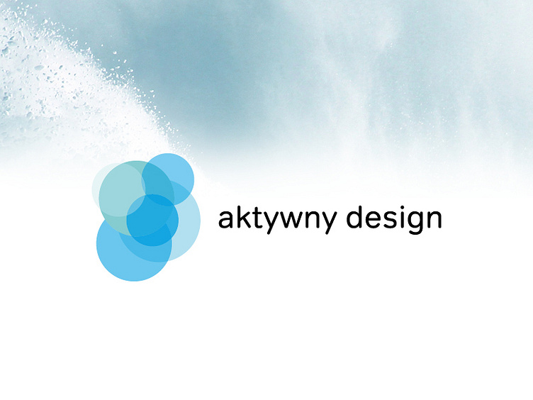
Logotype was created on a circle shape grid. Movement of the particular elements has a reference to a breathing. That choice is connected with a symbolism of active life.The colors refer to winter’s and water’s colour pallet. Shape of a logo itself is a reference to Olympic Games circles. Whole logotype has meant to be dynamic and industrial.