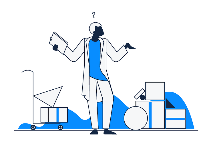
‘Product Not Found’ Empty State Illustration
Hey there!
The key requirement for the application design was to make it minimalistic and informative, so we followed these principles while creating all the illustrations as well. That also included using a narrow color palette which consists of the main app colors: white, blue and dark gray.
Although it’s commonly believed that an empty state is a thing of minor importance because it’s only a temporary part of the user experience, we believe that well-designed empty states can drive engagement, delight and retain users at critical moments. Little things are big, so paying attention to details is an essential component of quality design.
As a result, we ended up with a nice, clean and informative illustration that not only adheres to the app’s overall stylistic, but also livens it up a bit, making the user experience more enjoyable.
Press "L" to show some love!