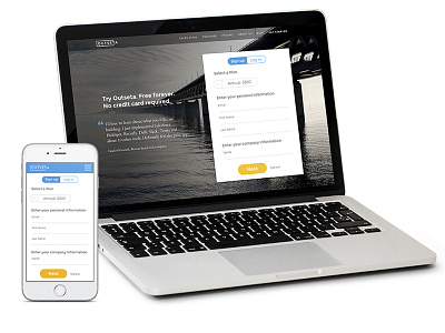
Outseta proposal
Proposal designed for a client. The request was to improve their current sign in form to make it easier and more engaging, and make it work in both desktop and mobile. The improvements of this design included UX, UI and branding decisions like repositioning the elements, design a whole new narrative and balancing the branding.
More by Rocio de Torres View profile
Like
