Qualcomm Logo Redesign


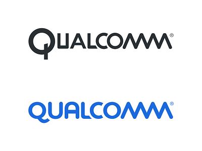
A logo redesign for Qualcomm that I did as part of a recent project in my Typography class.
My version is in blue.
When approaching logotypes, it's important to look for certain elements that may hold equity in the brand. In this case, I thought the double M (which portrays a digital signal) absolutely needed to stay. As it was not only recognizable but incredibly clever.
I then created custom letterforms based on Montserrat to fit this style and create a uniform look, which the current version lacks.
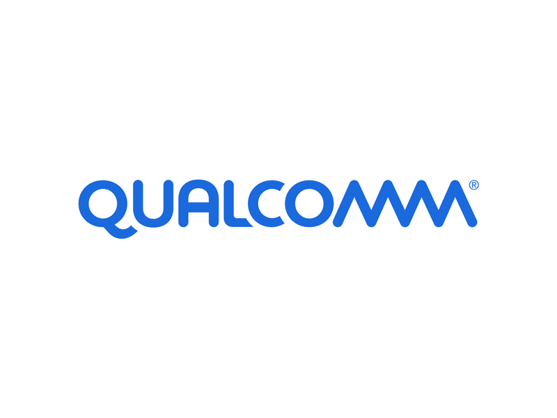
Modifications:
Custom tail on the Q
Rounded corners on L and U
Took the U and turned it into an A
Reworked the cuts on the L and C to fit the forms better
Let me know what you think!