Onboarding new App users (Tinder style)

As we are always trying to improve our user experience, we recently paid close attention to the first time experience of new users for our Mobile Apps. In the past, we showed new users a couple of slides explaining the most important features of the apps. But we were not convinced this onboarding experience was performing well. There was no proven added value for the user (or the business).
Our assumptions were confirmed by a recent user study. During this study, we noticed that a lot of people were immediately skipping the onboarding screens (slideshow), including the registration screen at the end.
We set out to create a better experience that not only added more value for our users but also added more value.
Goals:
1. Create a fun experience that shows our wide range of categories
2. Make it more compelling to create an account (give an incentive).
But we wanted to do more. We also wanted to improve the user experience by immediately showing new users “personalized” lots on the home screen, based on their interest.
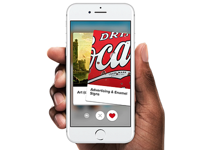
This is how “Tinder onboarding” came into existence, a playful way to present the user our wide range of categories. Same as the popular dating app, by showing a deck of 21 cards that users can swipe left to dismiss or right to love. A nice way for our users to tell us what they like. Tinder onboarding gives us the opportunity to immediately start personalizing the home screen so that we show users the content that they are most likely interested in seeing.
Download the app: https://itunes.apple.com/nl/app/catawiki-veilingen/id926272969?mt=8