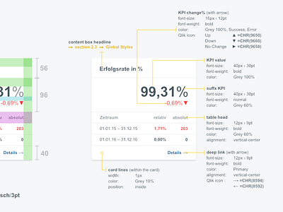
FS² UI Styleguide - Elements: KPI Tile
Pro Tip: Focus on the styleguide functionality instead of only visual aspects. It should enhance your workflow. Aim for reduction of iteration and try to standardize as much as possible.
This tile was reused so often during our development of our business intelligence performance dashboard solutions. If everything is clear the space for error goes toward 0 and you (as a designer) don't have to recheck it over and over again.
This was critical, because with our current technology stack we can't use CSS nor classes and we have to recreate them over and over again.
While working in the SAP & QlikView environment you will encounter such problems that you (as a designer) have to solve and provide the best possible solution.
More by Artur View profile
Like
