Handbag Landing Page — Second Edition

Landing Page for Handbag – UI Daily #003 Second Edition
I received valuable feedback on the previous version I shared—here is the revised edition. Looking back, I see that I hadn't given enough attention to the details on the page. More specifically, the typography and grid had much room to improve.
I made sure to limit the amount of type variance to ensure that my paragraphs was readable. I also broke the text up a bit.
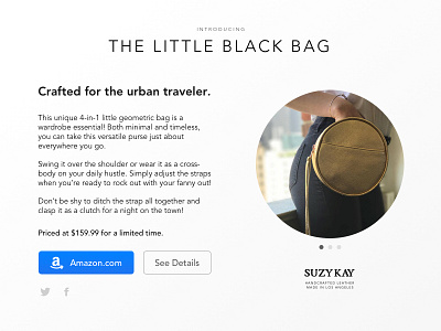
The image was wrapped in a circle, to give more emphasis to the product's circular form. The three dots below, a common pattern for multiple image slider, were added because typically products are showcased with more than one image. I could have also used thumbnails here.
The product takes center stage here, as it is a product landing page. The brand attribution was set just below the image in order to not feel like a basic landing page with a standard header.
Special thanks to Tanner for his feedback!