Amber & Ash: Product and Packaging Design


One of our favorite projects—Amber & Ash—had us designing both product and packaging.
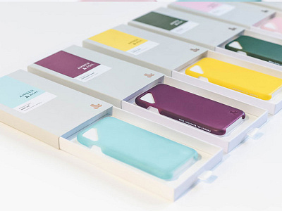
To add a premium touch to the packaging, the ampersand mark on the outer sleeve is printed with a metallic copper foil on a pale gray background, a nod to the amber and ash materials that inspired the company name.
The layout of the outer labels is clean and straightforward, the large block of color taking inspiration from Pantone chips — highlighting the most distinctive feature of the case and the concept behind the brand itself.
Featured in The Dieline
_____