Personal website update ⚡️
After a couple years procrastinating, I finally updated my website! ⚡️✨
I find personal websites to be paradoxically hard to deal with; whereas there’s no constraint, no client they’ve got to be up-to-date and mention only the useful bits, quickly! It’s easy to go overboard and do a fluff of heavy animations and colors all around for little corresponding content/complexity.
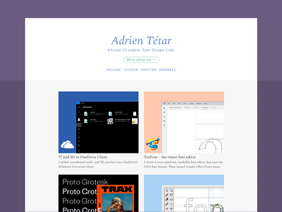
Here I wanted to bring on the critical pieces of info at first glance and leave the deeper details to relevant pages. You can see that w/ the one-liner description (zero meaningless sentence™) and all the links right at the top, a button leading to a more elaborate about page – and the showcase of my past projects right below. The graphics help a quick scan over the page.
Also, I tried to use chromatic colors without “jumping at your face”, so I kept tones of gray for the background and some text elements.
The actual implementation is similarly ✨, with about 200 lines of CSS, flexbox, atomic classes and very little media queries!
Font is Spectral, produced by my former employer Production Type. 🇫🇷
This is the first batch of updates, I’m working on the details page for each projects I am showcasing!
PS: take a look at the favicon! 😋
