UGA App Material Redesign

Excited to show off some of the work I've been doing on a redesign for The University of Georgia's native Android app.
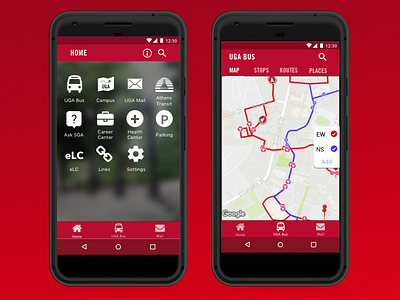
I brought the live bus-tracking map into the "UGA Bus" module to enhance discoverability of this fantastic feature. To highlight some of our most-used features and stay up to date with Material guidelines, I ditched the hamburger menu for a three-tab dock.
To create a more emotional experience, I wanted to really reflect the spirit of UGA in this redesign. I added a photo of the iconic Arch to the home screen and changed the icons to ensure there's no drop in legibility. I also changed header fonts to Trade Gothic, which fits into UGA's branding guidelines.
None of this is final. Our team is working to start delivering some of these updates over the upcoming academic year.
I'll put a full case study up on my Medium soon <3