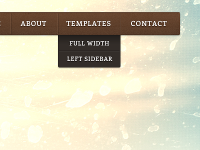
Travel Blog Nav
Been working on this before Christmas and such, decided as I have a bit of spare time to share it. Improved the navigation overall. I thought through the direction of the design as it's a travel blog, about sharing travelling experiences, you would want something brighter and upbeat. So that's what I changed about the header. As this is a theme I'm going to implement a way for the user to drop an image of generally any sort and it should fit in nicely as in the fade into the blue in the attachment.
More by Steve McKinney View profile
Like

