Dias Rebrand

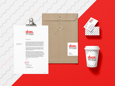

This is a rebrand project. I used red colour to add on freshness, compared to their former old pinkish one. The 'wave' and the 'dot' elements symbolize movement, since it is a digital interactive art space, where they work with light-represented movement.
Font: Sofia Pro (modified)
--
Client: Dias Kunsthal
Location: Vallensbæk, Denmark