Car Results List Re-design (web)

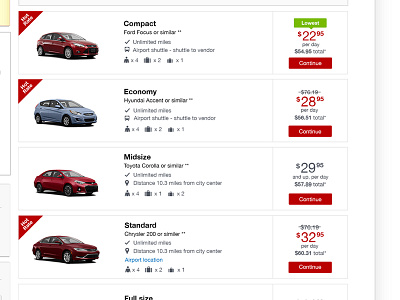


I re-design the results list on the car results page. This page used to be full of gradients for buttons, cards, and badges. Other than just refreshing the UI for the consistency, I also analyze the previous test results I have done for this page. From qualitative and quantitative user testings, I learned that the users feel more clickable with a button for a call to action. Also, with the Hot Rate badge, the users can easily find the Hot Rate deals and understand the difference between retail deal by seeing the education tile on the left column. I kept green pointy badge as the same color as the one from details page for a consistent experience. The test result for the UI refresh was 4.5% PR lift and as estimation of 1 million $$$.