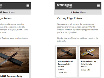
Information density vs image size
So I could do with a little help here (view the full size attachment).
I'm making some updates to our Cutting Edge Knives site (https://cuttingedgeknives.co.uk) and putting some serious focus into improving and optimising the layout because it's a little tricky having a lot of products on a single page on small screens because you see so few of them at any given time.
One thing we're introducing on the new site will be a filtering view (eg. Show £100-£200 range, show certain sizes etc) and with the current view of the site (the large single image view on the left) I do wonder if it's too hard for filtering to be truly efficient to get a quick overview or whether the larger images are worth it at the expense of showing more but with thumbnails that don't necessarily have enough detail.
If you were browsing an ecommece site on mobile that had a page with about 100 products from different ranges would you prefer a bigger long list of items (left) or a shorter grid view (right)?
Any comments or suggestions much appreciated and if you've seen any other sites that solve this nicely do let me know!

