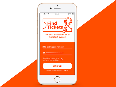
Daily UI 1: App Sign-Up Screen
For the first daily UI challenge, I created a sign-up screen for a fictional ticket vendor app. My main concerns were to use a minimal colour palette which is modern yet reflects the positive feelings and excitement of live events.
After initially including an "I'm Interested In..." section with category check boxes, I decided to remove this and focus on creating an uncluttered design which was easy for the user to understand.
What do you think? Is there anything you would improve upon? Thanks!
More by Richard Gray View profile
Like
