Preschool Website
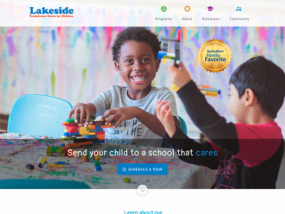
Initial stages of website redesign for a preschool website. Client had some elements from different templates that they really liked as well as an existing color scheme that they want me to use.
I also am the photographer of all the images used in this mockup. My goal is to make it fun, playful, welcoming, but also drew some inspiration from material design (if it's not obvious already).
Any feedback? I'd love some feedback on the overall look and feel, but also any constructive criticism is welcome! (fonts, placement, etc)
More by Lupita Dávila View profile
Like

