Alan Rogers Sneak Peek | Store
This iPad application is for Create DM and their Client, Alan Rogers camping guides.
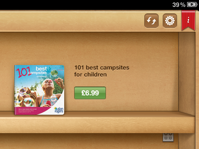
This is a very small snapshot of the Store screen (landscape).
This is going to be somewhat long, but bear with me - I feel I need to somewhat justify myself here…
I'm very happy with this iPad design, but the Store 'irks' me. As Designers, you know that sometimes you have to sacrifice aesthetics for user experience. I'm guilty of being a fan/member of the delicious generation, so where possible, I like interfaces to not 'just' work but look fantastic.
My problem with the Store aspect of this design, is the labelling and pricing of the books. The end goal of this application, is for customers to purchase books - therefore, they must be the focal. So, when it came to designing the labels and prices, I had to hold back. I had many ideas, my favourite being price tags, but having that element repeat itself 20 or so times on a screen is unappealing. Granted, the books are repeated, but their covers are not, so it isn't tedious. A price tag would also challenge the book in terms of size and screen real estate and risk distracting the user's eye and becoming a focal.
As a side note, I tried many ideas, such as shelf labels and the like, but this particular series of books has very long book names (ironically, the one in the ss being one of the shortest), so it proved a little difficult to fit alongside prices.
Ultimately, I used Apple as inspiration and tried to envisage how they would incorporate a Store into iBooks, had they not replicated the App Store. Is my implementation of labelling and pricing innovative? No. But, it works and it will be intuitive and distraction free for users to browse and buy books.
I wish I could show you the full screen, but my Client understandably would like to keep some mystery. In saying all of that, I can't wait to show you the rest of the visual design, this is my first iPad interface and I'm very proud of it!