Symbols in Dropbox Paper
Hi!
At Tooploox we use Dropbox Paper app quite heavily in one of our projects – mainly for day-to-day work, product specs, note taking, Scrum retrospectives, plannings and many more.
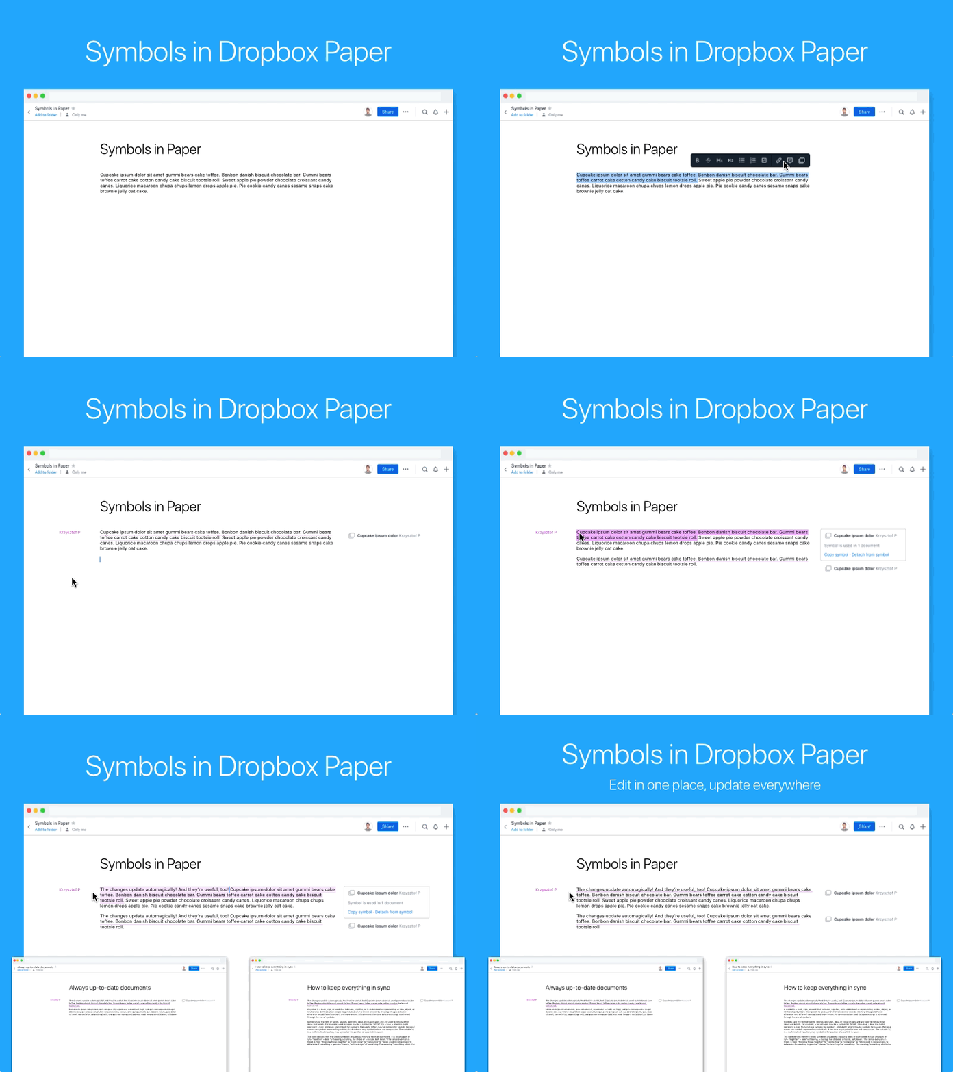
I’ve noticed that very often the same paragraphs are copied and used in different documents. If one of these paragraphs is updated, the rest becomes immediately obsolete. That’s why I’ve entertained the idea of having reusable pieces of content which you can update in one place and changes would be visible in all existing instances.
At first it seemed to be a fairly easy task. You have just bunch of states for text selection and symbol bubble. Simple, right?
But there’s lots of product and interaction implications.
When one starts thinking about this challenge, it becomes clear that many product areas would be affected. In case of symbols, these are:
- read mode,
- edit mode,
- comments,
- document history,
- in-app notifications,
- e-mail notifications,
- permissions,
- mobile apps,
- dozens of others I don't know about.
Wow, that’s a lot! And we only wanted to do one “simple” feature!
I assumed that symbols could be anything: text, images, videos, files. It would also make sense to include some sort of additional barrier for editing them to avoid accidental modifications. I’ve decided to use additional click as a way of starting editing the symbol. User would click to select symbol and click one more time to enter edit mode. Clicking outside the symbol would exit edit mode. Ideally, changes made within symbol should autosave as user is typing as it works in the rest of the app. Editing symbols should also be accessible via keyboard and on mobile as well.
The next steps would be creating more interactive prototypes of this behaviour and testing it with people to see if it really feels that natural and intuitive.
