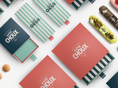
MAÎTRE CHOUX BRAND IDENTITY CONCEPT
If I'm in the vicinity, and if my bank balance allows it, I treat myself to one of Maître Choux's deliciously crafted pastries. Beautifully constructed and filled to the brim with the most wonderful cream, these pastries are a little bit of France to behold. There is no better pastry chef than a french party chef.
One downside for me has always been the branding of Maître Choux, of course this is purely a personal opinion, Monogram are a fantastic branding agency and they certainly have a lot more experience than I do in brand identity, but while I'm certain that what they created for Maître Choux fits the brief of the client, I personally can't help but feel a disconnect between the logo and the product, the logo and the craft, the logo and the heritage of the french patisserie.
Maître Choux's current logo is minimal, premium and playful but I think the disconnect for me is that ignores the artisanal aspect of the business and whilst I am a forward thinker looking to modernise most aspects of life, I like keep one foot in the past, and a nod to the traditional roots of which the business is built on, I feel was trick missed when it came to branding Maître Choux. So with this, I gave myself the challenge to create a brand identity for Maître Choux which was premium and playful which also embraced the craft and the heritage of french pastry.
