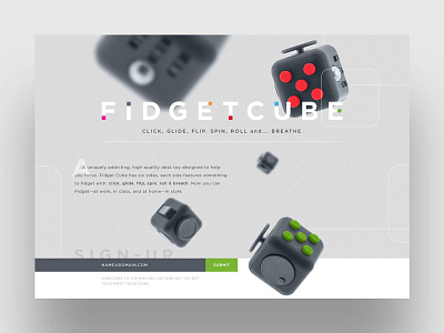
FidgetCube Landing Page
I was tasked with designing a landing page for FidgetCube that would, "showcase the product features and benefits while capturing emails so they can market to users once their product is available" and gave me "creative freedom to play with their brand."
While this concept wasn't used, it was fun to play with the cube itself and use it as the key feature of the landing page. The logo, itself, features six different cubes, representing the six different sides/features of the cube. I also thought it would be fun for the background and foreground cubes to animate and different speeds as you scroll down the page.
See attached for the full design and logo.
More by Steve Paterson View profile
Like


