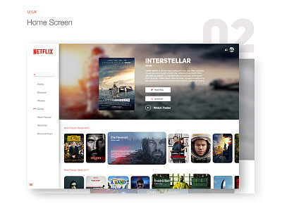
Netflix | Ui Redesign
Shot 02.
Hi Guys,
This is The Home Screen of my latest Behance Project. I have been watching a heap of Netflix over the past few weeks. I totally love the service but the design sucks so i thought about a cleaner Version of their Web and App interface.
Hope you like it:)
What do you think? 💭
Appreciate all thoughts and feedback!
The Full Project on Behance (App Design icluded): https://www.behance.net/gallery/49110465/NETFLIX-RedesignConceptIOSUIUX
More by Niklas Dunsing View profile
Like
