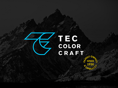
TEC Logo Option 1
An unchosen logo concept for my client who does digital and screenprintings. They wanted a simpler icon that payed homage to the legacy of their family owned company. They had some AMAZING marks in the past, but they were a bit too dated and not easy to apply. So we created a clean, retro inspired mark. Sheets of paper fold and bend to create the a TEC monogram. We didn't end up moving forward with this option but I still really dig the mark.
More by Hoodzpah View profile
Like
