HSco 09 - which do you prefer?
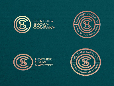
Can't make a decision on this monogram and seal.
Do you prefer the roundness of the top row, or the ovoid shape of the bottom row?
The ovoid version better represents the typography I'm using, but I'm wondering if it just looks like a squished version of the top row. But this could just be because I'm looking at them together.