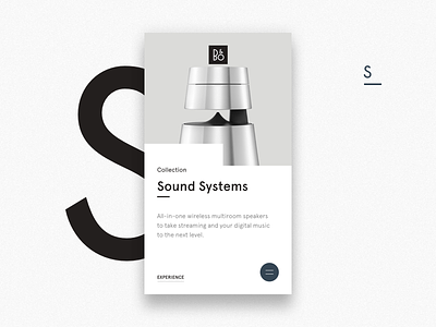
B&O Sound Systems X1
This is the first shot of an experiment i am currently working on. This is one of the product category pages from the B&O website, ofc. with my own re-designed UI to have a clean, strict design, paired with a beautiful humanist font.
The experiment is to have everything within thumb reach, so once you tab the menu button, you will see a very traditional layout for navigating main categories. But you will have the option to swipe through all the sub-categories via images with the thumb in a beautiful & intuitive way.
More shots will come tomorrow, and animation will come very soon :)
Click the attachment for full glory design
Press L to show some love
More by Michael Bing View profile
Like

