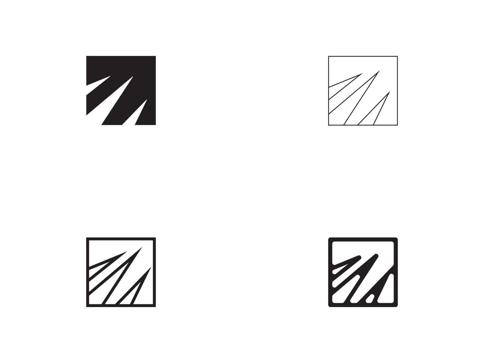
2012-Present
For some reason this morning the first iteration of my logo popped in my head, so I decided to have a look at the 4 of them in relation to one another. I really haven't followed any sort of theme in adjusting the logo, I've only made slight adjustments to the shape since 2012 -- Mainly, just keeping the shape in mind. It's kind of interesting what I found out from lining up the different versions side by side. Over time I've subtly formed it from a very rigid block form into something less sterile and hard -- Into something that's soft and almost organic feeling. I never intended for that effect. Kind of funny how even in the digital form, shapes can tend to become eroded.
More by Jeremy Richie View profile
Like
