UX Improv #1 - Amazon Prime Video (2/3)
Continuing from Part 1 of Amazon Prime Video app improv -
The primary goal of the homepage should be to help the user out with user-curated content or content that's curated by an algorithm for the user.
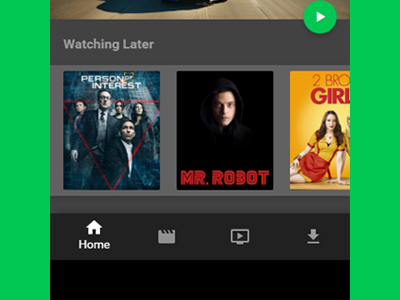
We all have put a video in the Watch Later list on an app, and that list is something that isn't accessible. In the original Prime Video app, it's available in the Navigation Drawer which is a component that is rarely slid open.
Hence, Watch Later lists were made available on the Home tab itself. Speaking of Tabs, we've utilized a component which carried itself in Material Design fairly recently. The Bottom Navigation Drawer tends to focus on the most important things as it's tabs.
Home > Movies > TV > Downloads
While others are self-explanatory - downloads is the section which is actually interesting since it can be programmed to automatically open at that position when the user isn't connected to a strong WiFi network or internet connection. This allows the user to view what's downloaded without the need to go through multiple empty states, thus reducing number of taps.
