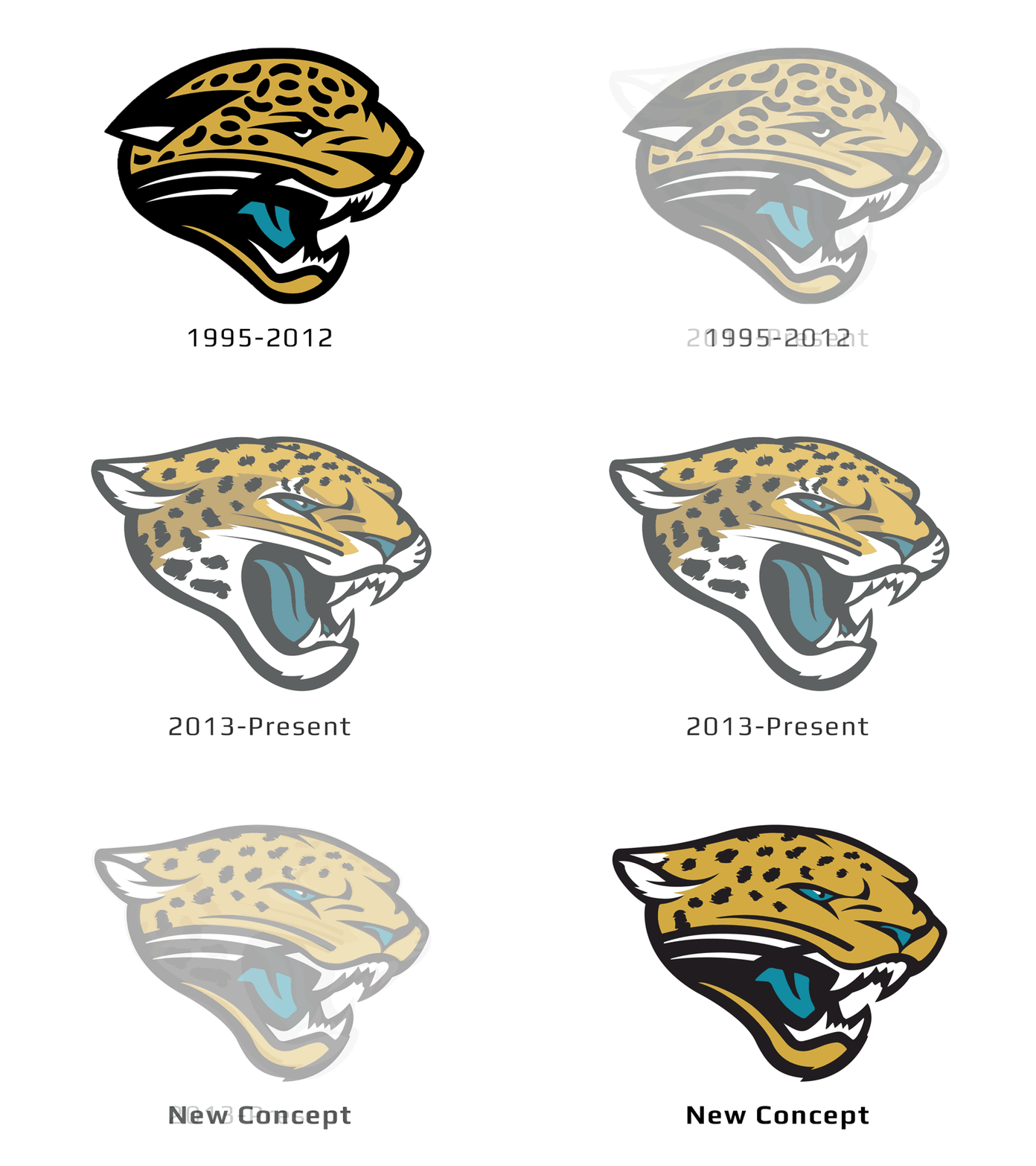
Jaguars logo mashup
Since the Jaguars rebranded in 2013, I've felt that their logo is too illustrative and busy. Their original mark, while simple and memorable, had too many design flaws (crooked jaw, cheeto puff spots). This concept merges the strong points of both marks.
View all tags
Posted on
Nov 20, 2016
More by Thomas Hatfield View profile
Like

