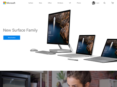
Microsoft Website
Not a commissioned project. I was just curious about the Microsoft website and tried to imagine it being closer to the products. The current site feels cluttered, corporate and doesn't do justice to the amazing products like the Surface, Xbox & Holo lens. Simpler, cleaner & Yes… rounded buttons!
More by Naim Sheriff View profile
Like
