Chair Icons: Which one is best?
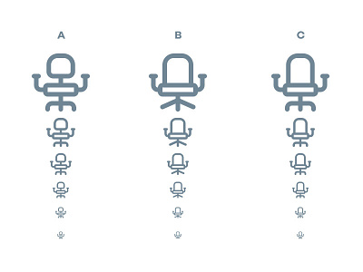
I've been playing around in illustrator, trying to create the best darn office chair icon I can. I've narrowed it down to three. Which one do you think looks best/most identifiable: A, B or C?
Sizes displayed are: 128px, 64px, 48px, 36px, 24px and 16px (although they'll probably not be displayed this small in the website they're destined to appear on).
More by Adam Stuart Clark View profile
Like
