Beer & Branding 2015 Design Concept
This particular concept was the third attempt at nailing down a style for the final logo & packaging design for Beer & Branding 2015.
The first concept had more Japanese influence with the script typeface and use of Sumi inks and traditional painting techniques - you can see the photo montage of that concept attached.
That concept wasn't quite right since we decided to focus on the honey as opposed to the lemongrass, so it got scrapped.
After he mentioned using local wildflower honey - the Tom Petty lyrics to 'Wild Flower' started to take the design concept in a more natural, country, relaxed direction - which lead to concept 02 and is also attached.
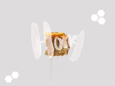
Looking over the two initial concepts, I decided to focus on the brush script logo concept, harkening back to the Japanese influence, but go in a more modern and clean direction while focusing on just the honey.
This image captures the chosen design direction that would later get refined, leading to the final logo and packaging design.


