RS photographer logo

Finally finished this logo for a photographer friend of mine,
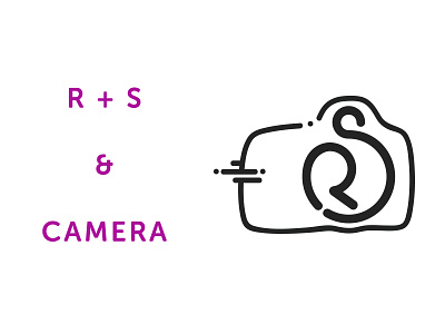
Her initials are R and S.
I had creative control on this, but i soon figured out that she wanted it to be cute and feminine.
The RS is shaped to look like the lens of a camera, and the camera outline is based on the tool of her trade, a Canon camera.
She's happy with it, and i'm happy with it, check attachment for main design.
The cuteness factor is a style i like a lot and that i've been playing around with and i think suits this well...