New Login

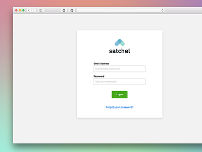
In accordance with our new accessibility standards I recently wrapped up implementing, I also gave a little face lift to our login page. May not seem like much, but a few of the improvements that you can see here include:
1. Title case for buttons
2. Title case for input labels
3. Contrast between content and backgrounds
4. Inner shadows and highlights on input forms
5. New color for buttons (contrast and a11y compliant)
6. New color for links (contrast and a11y compliant)
I'm slowly and surely working on a better and more reliable way to design for our target market and accessibility concerns were a big win for the design team this week. It has really boosted contrast and legibility throughout our app as well as better guiding users towards actions they need to take as our target market struggles with technology. Building a familiar, intuitive, and easy to navigate application has really made it's way to the top of our list and pushes stylistic and trend choices to secondary thoughts, as they should be.